
energy tracking
Energy Map: See Exactly What Drains You
A new app connects each hour's activity, place, and company to how energised you felt, so you can finally see the patterns behind your tired days.
Artem
Founder
· 5 min read
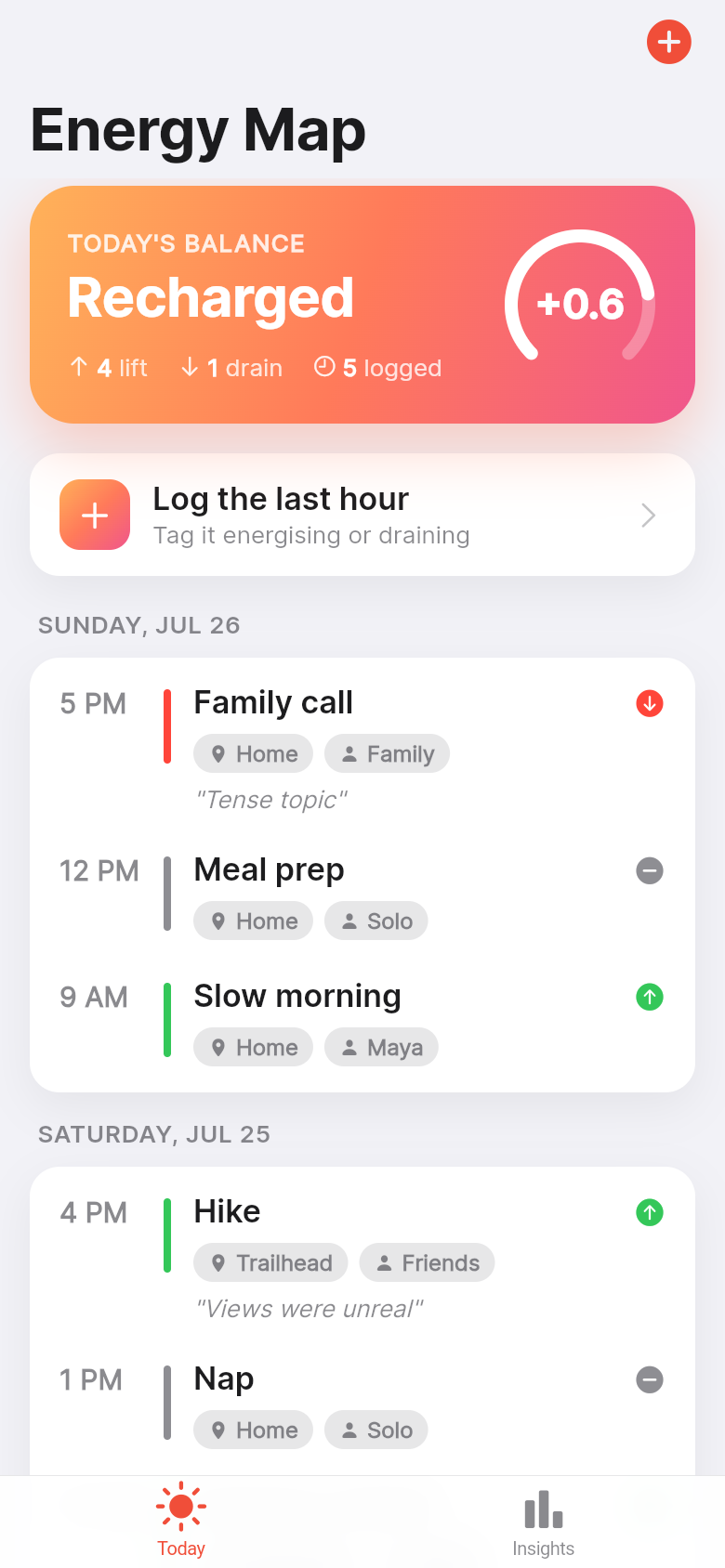
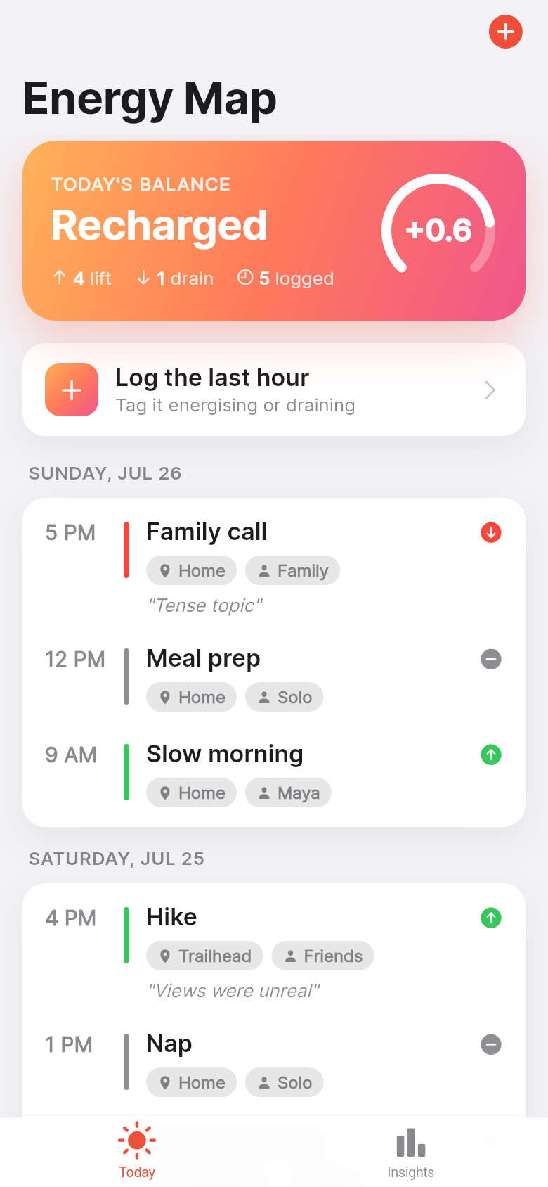
You finish a Tuesday and feel hollowed out, but you can't say why. The meetings weren't unusually long. You ate lunch. You slept fine. The problem is that nothing in your existing tools connects a specific 10am call, the open-plan office, and a particular colleague to the slump you felt by 2pm. Time-tracking apps measure duration. Mood trackers give a whole day a number. Neither one tells you which combination of activity, place, and people consistently leaves you running on fumes.
Energy Map was built around that gap. It lets you log an hour in a few seconds, attaches it to a place and person, and marks it energising, neutral, or draining. Do that for a week and a heatmap lights up your patterns. Do it for a month and you have ranked lists of exactly which activities, locations, and people lift you and which quietly cost you. Try the live app in the frame below and you will see the idea land immediately.
Live demo
One tap, then move on
The fastest way to kill a logging habit is to make the log feel like work. Energy Map keeps the entry form to four fields: what you were doing, where you were, who was there, and a single energising/neutral/draining choice. An optional note sits at the bottom for the days when context matters. The whole thing takes about ten seconds.
That speed is a deliberate design decision. The app is meant to fit between tasks, not become one. You log the team standup, close the sheet, and get on with your day. The value accumulates quietly in the background, building a picture you only need to look at once a week.
The weekly heatmap: patterns you couldn't see before
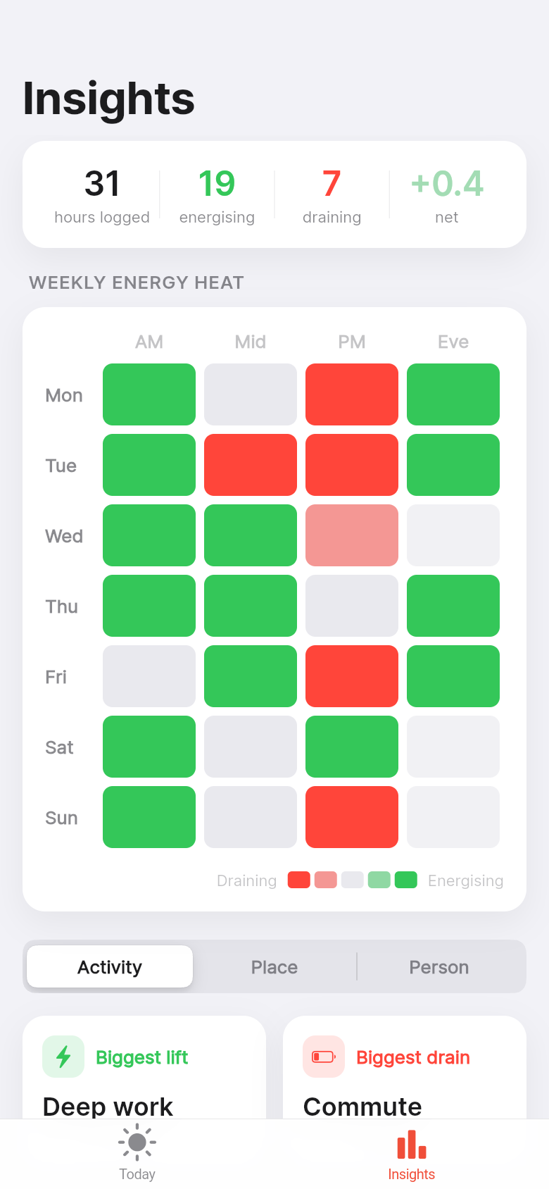
Flip to the weekly view and you get a grid, weekday columns against morning, afternoon, and evening rows. Each cell is coloured by net energy: a warm tone for energising hours, a muted one for draining hours, neutral in between. Patterns that were invisible in your calendar become obvious at a glance.
Maybe your Monday mornings are consistently green and your Wednesday afternoons are almost always red. Maybe evenings at home recover you but evenings at networking events do not. The heatmap doesn't tell you what to do about it, but it shows you something you almost certainly did not know: that the pattern is real, repeatable, and worth acting on.
Interact with the embedded demo above and tap into any cell. You will see the individual logs that made up that slot, complete with place, person, and any notes you added. The drill-down is the feature that turns 'I feel tired on Wednesdays' into 'I feel tired on Wednesday afternoons after the 2pm client sync in the main conference room.'
Rankings that put numbers to your gut feelings
Most people have a suspicion about which meetings drain them or which colleague leaves them feeling flat. Energy Map makes that suspicion concrete. The rankings tab scores every activity, place, and person by net energy across all your logs. At the top you see what consistently lifts you. At the bottom you see what does not.
This is where the app earns its keep for burnout-aware professionals. It is one thing to feel like your weekly all-hands is exhausting. It is another to see that it has the lowest net energy score of anything on your calendar, lower than the commute, lower than your most frustrating admin task. That specificity changes what you do next: you ask for a shorter format, you propose a different day, you stop booking anything demanding immediately after.
The same logic applies to places and people. Remote work from the home office might score higher than the co-working space you thought you enjoyed. A colleague you assumed was neutral might consistently appear in your draining logs. The rankings don't judge anyone; they just show you the data you logged yourself.
Built for people who already pay attention
Energy Map isn't trying to convert someone who has never tracked anything. It is built for people who already journal, already habit-track, and already think carefully about how they spend their time. Those people don't need gamification or streak counters. They need a clean tool that does exactly one thing well and gets out of the way.
The app opens to a meaningful screen even on day one, before you have logged a single entry. The first open shows you the structure clearly so you know exactly what to do. After a few days of logs the heatmap fills in. After a week the rankings start to mean something. The payoff is proportional to the honesty of the input, which is exactly the bargain reflective people are comfortable making.
From idea to working app
Energy Map started as a single sentence: a way to connect daily activities to energy levels so you can spot what drains you. From that description, Leanfinit built a complete, native-feeling iOS app, including the log form, the heatmap view, the ranking system, and the drill-down detail screens.
If you have been carrying a similar idea, something specific to a problem in your own life or work, the same process is available to you. You describe the tool you wish existed and we build it. No code, no waiting, no compromise on the thing you actually wanted.
39
files in the build
40.2 MB
app bundle
Flutter Web
runs in any browser
Have your own tool idea?
Describe the app you wish existed and we will build it for you, working and on your phone, from a single idea.